Logo Design Process for Wagmu
I have completed a brand identity design for Wagmu.com. John (owner) approached me through my website, and asked if I could assist with the re-design of their existing logo. John has a website promoting diet tracking, menu planing, and nutritional analysis (www.wagmu.com), a wonderful service that John is providing!
Design Brief Supplied by Client
“Wagmu” means “pumpkin” in the native American Indian language of Lakota. The Wagmu website uses American data, and is currently being marketed to Americans (though it is open to anyone worldwide). I want to present a fun and playful image. – John
The orange and green in the text “The revolution in food and cooking, diet, groceries, health, nutrition, vigor. Free diet tracking, menu planning, and nutritional analysis.” I am pretty well settled on those exact colour, and would change them only for a very good reason. (I’ve attached the color scheme as it is now). Colour besides those two should be mainly grayscale. Your comments would be welcome. – John
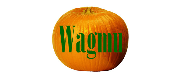
Existing / Original Wagmu Logo Design
Original Logo on Wagmu.com Website
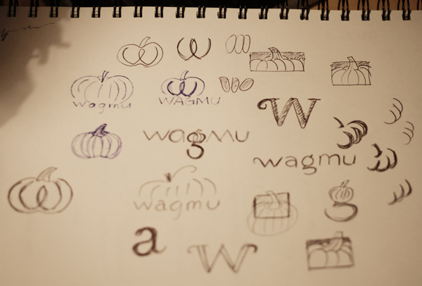
A page of my initial sketches for the logo concept
Before going anywhere near the mac to help me generate my initial concepts, the pencil and my trustworthy sketch book are my best tools! Keeping a sketch book is essential for my graphic design career, and this is how I was trained at Uni. I don’t show everything I have sketched for this project here, just a relevant page towards the final concept.
After reviewing, researching, sketching and graphic designing, I used Freehand to draw from my sketches, then supplied John with 6 drafts of the Wagmu logo variations. (I still prefer Freehand 9 developed by Macromedia for drawing, but sadly the company was bought out by Adobe, and had Illustrator as the replacement)
Client’s Feedback
I like best the top middle, top right, and bottom left, but they all have nice features.The top left may be the right thing for the pumpkin icon, I have to think about it. The cropped pumpkin implies a much bigger pumpkin, compared to if it were a whole pumpkin, which is fun, as it implies “there’s more to this than you can see”. As an icon, it would need to be contained in a 16×16 pixel square, so it couldn’t have the stem protruding from the top, unless the top row or two of pixels were white.
The black backgrounds are striking. I see that the black provides excellent contrast to the pumpkin. But I don’t think I like it, despite it’s obvious good looks. Could this be green?
I like the curls on the bottom middle – they’re adorable! – but not the light-weight pumpkin. I like the green on the bottom right, but again, not the light-weight pumpkin.
My son thought the “g” on the top right was “weird”, but I really like it.
I was also surprised to find that I liked the light tan background on which you set the images. It makes me think I should be more flexible in my website colors, perhaps using tans and browns.
Again, beautiful work! It inspires confidence. – John
More feedback
I have taken professional advice on which logo to use. I have asked a student of linguistics, a computer programmer, a councilor, a retired housewife, and a retired doctor!!! LOL!!! Based on this high-quality input, I’d like to choose the top middle logo for additional refinement.
- Please rotate the pumpkin, so the stem points toward the right, rather than toward the left. I see the stem has a straight left edge and a curved right edge – keep the straight edge on the left. Why? Because I think that the stem pointing right suggests progress, while the stem pointing left suggests going against the grain.
- Please brighten the colour to something closer the the official Wagmu green and orange that I sent in my first specification. I really like the muted olive, but I feel committed to the brighter colour.
- I see the pumpkin image at top left has whiter stripes than the pumpkin at top middle. I think I prefer the whiter stripes in principle, as crisper, but I think I like the gradient in the middle simply for aesthetics!
- I wish the ‘w’ in wagmu were capitalized, like ‘Wagmu’. But I don’t know how to change the drawing to make that happen. I suppose one idea is to let the ‘W’ overlap the pumpkin, but this is the mathematician talking to the graphic artist. – John
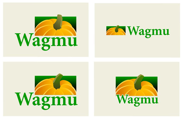
Logo / Logotype Placement Variations
The Final Wagmu Brand Identity Design
Graphic Industry File Format Supplied
- EPS – Scalable Photoshop format
- SWF – Vector online graphic
- SVG – Vector based format as per client’s request
- Tif – CMYK for offset printing
- JPG – For web and screen use
- ICO – For website Favicon
- GIF / PNG – With transparent background for the website
I will be adding more of my graphic design processes here on my blog, hope to see you next time!


6 Comments
Join the discussion and tell us your opinion.
Awesome work, it is good to see how a logo is developed from drawing. Look forward to seeing more work progress on your site soon. thanks for sharing
Good post and this mail helped me a lot in my college assignment. Gratefulness you for your information.
Look forward to seeing some more design processes on your blog. this is very helpful for a uni design student like me.
Great post – it’s great seeing the process of logo design. best, simon at Pixmac microstock photography.