Ijada Logo & Web Design Process
We’ve had great pleasure in the design and development of the new Corporate Identity System, and the new Website Design for Ijada Consulting Limited.
Ijada is an unique advisory services and networking opportunities tailored especially for current and prospective clients in New Zealand’s education and migration industry.
Ijada (pronounced eee-jar dah) is Spanish for jade/green-stone. Jade has a very special place in many cultures, with particular significance in both New Zealand and China. For the Maori and Chinese people, it represents beauty, strength, life energy, calm and permanence amongst many other positive attributes. As such, jade represents the common link between our Asian and Pacific cultures.
Brief Design Concept
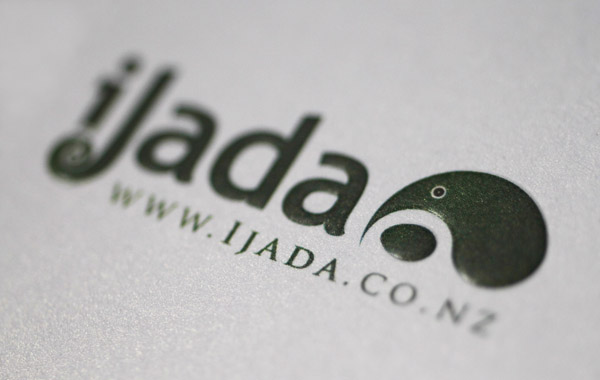
The logo represents a traditional Chinese yin-yang motif, stylized as a kiwi nurturing its egg. The kiwi (a small flightless bird) has long been a symbol of Aotearoa New Zealand and its people. The egg represents the potential that this beautiful and innovative country offers to the world.

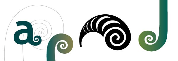
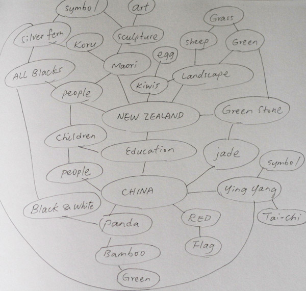
A sample page of brain mapping for the development of the Ijada Corporate Identity System Design
Final selected logo design for Ijada
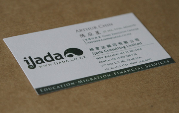
Business Card Design
Letterhead Design
‘The letterhead is merely just a piece of paper to write on, but really a functional piece of equipment for a business. There is much to the letterhead than meets the eye, what does a letterhead look like blank or when written? How is a letterhead folded? Where should information go on a letterhead? Where should a logo appear on a letterhead, and why does it appear on the top right hand corner? There are a lot of functional and aesthetic questions to be asked, and are required to be thoughtfully constructed for it to function the way it should!’ – Joseph Ku.
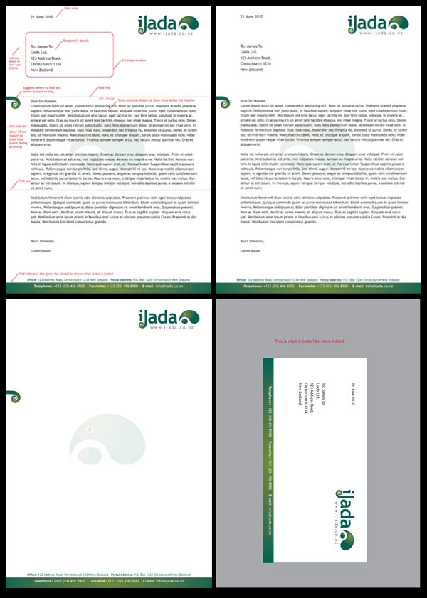
A letterhead sample showing:
- Letterhead with design elements and notes.
- Letterhead showing texts on.
- Blank Letterhead.
- Letterhead folded up
The New Company Website Design
We have chosen a professional clean and elegant approach, with the corporate color green flowing through the theme of the site. The site is an informative one, with user log-in capability for client’s staff to log-in and add new contents to the site. It has a member’s subscription where customers can subscribe to the site via Google Feedburner or RSS. The site will have a paid member’s area when traffic and site contents become substantial, member will pay a small fee to read invaluable information on New Zealand education and migrating to New Zealand.
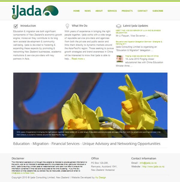
The website is still under development, one of the scheduled features is the Chinese translation to appeal to the Chinese market as well as the English speaking market. Below is screen grab of the web-site for a quick preview, or visit the Ijada website for more details about the company.
