Graphic Design as Art – Part 1/6
 When I say ‘Graphic Design as Art’, I mean there is no ‘Client’ involved in the process of making, and there is ‘No Commercial Value’ in the work produced, and most importantly, there is no one I need to please apart from myself!
This is the visual representation of my written work completed in 2000. The story started in 1988 when my father made a life-changing decision to immigrate to New Zealand. It has been an important event of my family, and this became the subject of my post graduate studies on Typographic Design (Chinese Typography) at the School of Fine Arts University of Canterbury.
This body of work was exhibited in the Christchurch COCA Art Gallery in 2000, the ‘dreamseriessixhundred‘ Fine Arts Postgraduate Exhibition.
This is the first time my personal design works are shown on the internet!
Altogether 6 pieces of works were produced @ 50cm x 100cm:
1. The Unknown
5. Believes and Career
6. The Wedding
About my work
I have always been fascinated by my Chinese culture and I am especially interested in exploring traditional Chinese typographic attitudes.
Chinese characters were originally drawings of objects (pictographs), but over time they have been continuously refined to the point they are now largely unrecognisable as images acquiring, instead the symbolic nature of the western typographic system. By re-applying the imagery into a character, the character can then be read as an image and can therefore also be understood by people with different language backgrounds.
Having this concept in mind, the structure of this work is based on the story of my family immigrating to New Zealand. The story centres primarily on the life of my sister Yiyi.
The work remains as a valuable record for the future generations of my family and also a typical story of the many immigrant families that surround us after the New Zealand government changed the immigration policy in 1987. Apart from typographically exploring two different cultures, this work offers an opportunity to understand Chinese language, and people.
Written Work: Chapter 1 – The Unknown
Very soon our home was going to be somewhere down south, 9000 kilometres away from everything we knew. At 20 kilometres a day, it would take us nearly a year and half to walk that far. Even from the relative comfort of an aircraft, we faced a journey into the unknown, and were full of curiosity and excitement… [Read More]
Visual Work – Sections on Close up

Visual graphic interpretation of Taiwan as a very dense and crowded place, the red marks ‘人‘are Chinese character for ‘Person’, representing the 5 members of my family.
This was just the image of Taiwan at that time (in 1988), it was not till after our recent visit back to Taiwan to realize what a beautiful place Taiwan really is! Below are some of my older posts about my trip to Taiwan:
1. The Li Shan Mountain of Taiwan
2. Lunar Chinese New Year in Fo Guang Shan

Western typography set in Chinese style font. When we first arrived in New Zealand, we could speak no English. This is a graphic representation of an experience of trying to find resemblance or similarities around a strange new place.

Here I have played with the visual graphic material found in our passports. This looks at authenticity, and the bureaucratic procedures of our journey to New Zealand.

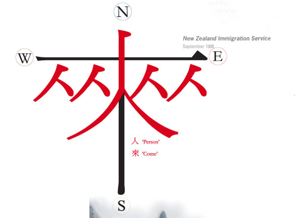
‘來‘ = Chinese character for ‘To Arrive’ or ‘To Come’ . This is a visual exploration of Chinese Typography, pictorial aspects are added to an existing character to give it a new meaning. In this section I have added 2 more person ‘人’ to the Chinese character for ‘To Arrive’.

Chinese Characters are written in an orderly manner, stroke by stroke. ‘古‘ is our surname ‘Ku‘, here I played with the stroke writing sequence of our surname. Altogether of 5 strokes, and each stroke representing a member of our family.
 ‘
‘
Now we have left our homeland, and arrived in New Zealand – a place with endless green field and sheep!
On the foreground are our signature in Chinese and English.
The next piece of work is about finding a new home in New Zealand. Our journey touring around this beautiful country in an attempt to find a suitable city to live in.
2 Comments
Join the discussion and tell us your opinion.
great designs mate.. graphic design is an art form. creative and visual artists use digital media to express themselves.
i suggest, if you still don’t have one, that you create your Facebook Page and use Facebook to display your artwork and express your creativity.
good luck in your endeavors.
Thanks for your encouragement Shayne! Yes, I agree and will setup a facebook page for my studio soon.